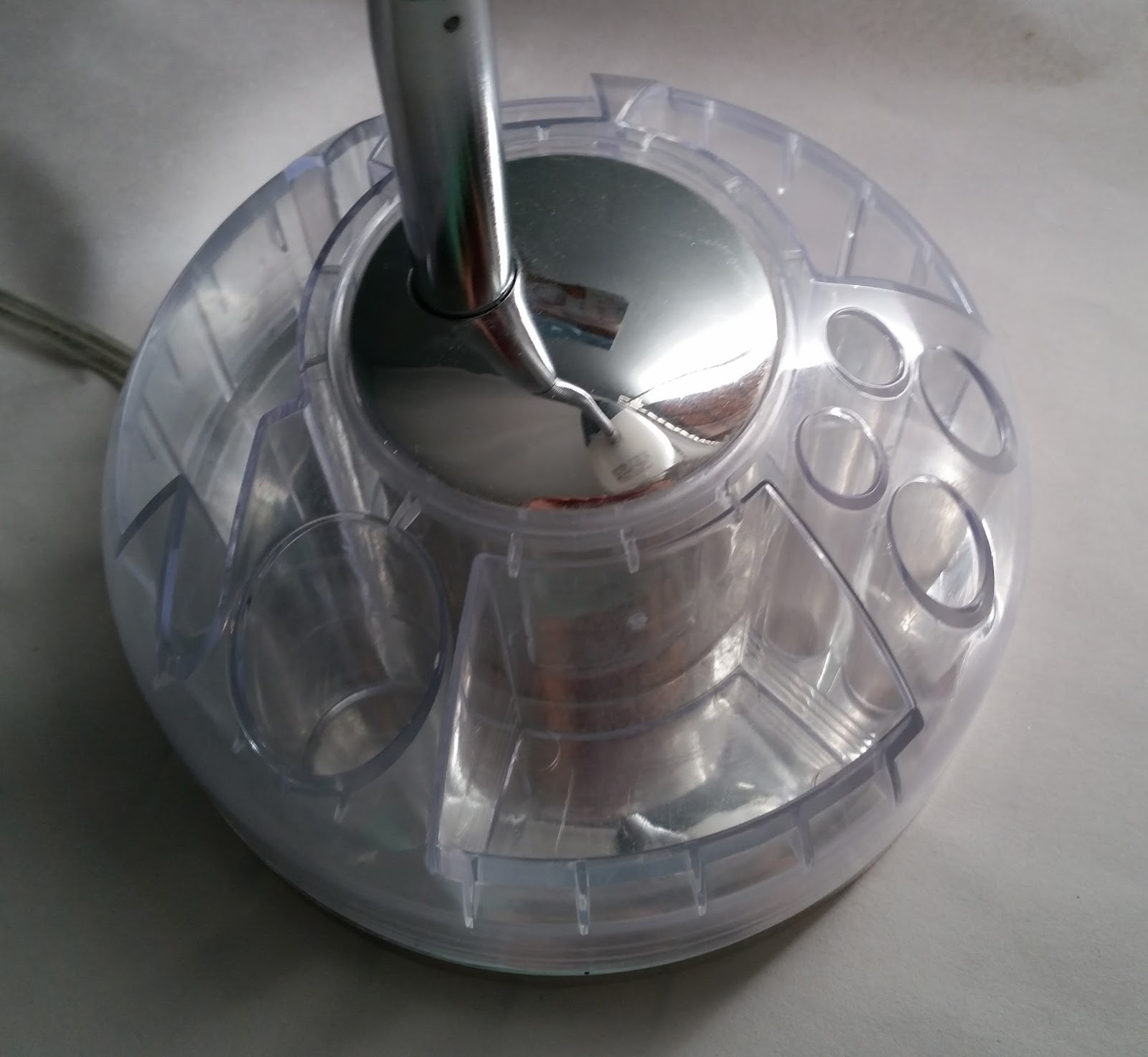
Saturday, December 5, 2015

Star Shower Laser Light

What seen in this picture is a star shower laser light. It functions by electricity, when plugging in the cord into a power outlet, and the flick of a switch. It only works in the dark. It is intended to be used by householders to use it to make their house exterior and things around it (e.g., trees) filled with star like lights. The device creates thousands of colored stars around the house. It is created since it is a great device to be used to provide star shower light in a more easy and convenient way, without having the user to use the old light chains and hang them all around their house to decorate the house. This is a single piece device that is put on the ground, in a little bit of distance from the house and cast the lights on the house. The device has a handle on the bottom of it which could be located on the circular platform provided for it, so the user could place the device easily on the ground. It also has another extra handle with a pointed sharp end that could be used instead of the circular platform, and it is connected to the handle of the device so that the customer could place the device on the grass. The device is made of hard plastic, which makes it durable. The area where the lights have to go through are made of glass. A few of its other features is that the device has whether resistant casing, and it covers over 600 sq. ft. The only negative part to this device which could be improved is its very short cord, which needs to be longer, so the user will not need an extension cord.


Kenmore Countertop Microwave

What seen in this pictures is a counter-top microwave. It is could be used at home by the household, in workplaces by the employees, or even in schools / colleges by the students. It functions by electricity, and also by using the features located on one side of the device (e.g., the start or stop button). It is created to heat the food placed in it. The material used for the exterior part of the microwave is mostly metal, which is a durable material. The door of the microwave is made of a strong glass which is also very durable, and it is glass since the transparency of it will let the user to see the food inside it, when it is being heated. One of the good design features for this product is that on one side and also the top part of the microwave there are a few small openings from where the heat from the inside could get out, so the inside area won’t be damaged by the degree of the heat, when the device is on and working. Some of the other great features of this device include: sensor cooking, one touch settings, multi-stage cooking, 1100 Watts, and electronic touch pad controls. It has also a timer indicating the user the minutes or seconds left for the microwave to heat the food. There is a button on the lower right corner of the device which is used to open the door. When closing the door, the user just has to push the door. In terms of its space and depth within the interior (where the food is located), this microwave has a good amount of space and depth which is good since it could handle bigger plates or other containers. The only improvement that would be useful for this device would be for it to have a handle for its door, so it would be easy for the user to handle with the door, both during opening and closing it.


Saturday, November 28, 2015

Black and Decker Rechargeable Vacuum

The product seen in the picture is a rechargeable vacuum. This is a rechargeable vacuum which means that all the user has to do is to charge it with the charger provided for it and then use it after it is fully charged. It is intended to be used by the general public and can be used for quick clean ups in places such as home, office or in the car. The good thing about the design this device is the fact that it is small, light-weighted, and portable which makes it very easy to use to clean areas where it is harder to clean with the regular larger vacuums that people usually use. It is great for cleaning places with angles (wall angles, closet angles, and other places like this) or even tight places without any problems since the device is very light and easy to handle. Moreover, the suction tool which is used to pull the debris inside has the capability to extend which is a good bonus for the user since it can make the suction tool to reach easier to the desired place where the user wants it. The large mouth of the suction tools allows it to intake large debris. The transparent dirt bowl is yet another great part of the design of this product. The transparent dirt bowl makes it easy to see the dirt inside and know when the bowl is full. The bowl is also removable (which makes it easy to empty the dirt), and it is also washable. The vacuum is made out of hard type of plastic, which is durable. Plastic material makes the vacuum to be light-weighted and easy to carry around. The colors chosen for this product—blue and white—are also very smart and good choice since the blue and white indicate cleanness and purity and this is what the product is intended to do, which is to clean and purify. All the features of this product are very effective and useful except for one thing. One improvement that would make this product even better would be to make the dirt bowl just a little bit more since the filter device is also located within the bowl and takes up some space of the bowl. So, it wouldn’t fill up soon, especially when there is a lot of dirt to be cleaned and the user wouldn’t have to worry about emptying the bowl so soon.


Royal 12-Sheet Cross-Cut Shredder

The product seen in the picture is a paper shredder which functions by electricity. The user has to plug the cable into electricity when they want to use it in order for the device to function. It has a thin area on the top part of the device, where the papers go through, and the user would have to press the on button next to the thin area to operate the device and then put the papers through it. Then, after the user is done, they would have to press the off button (there is only one button functioning as both the on and the off button). This device has a few good design features. This is a good device to be used at home for the household when they need to shred papers that contain personal or other valuable information. Moreover, this device is able to handle papers, credit cards, and staples. It is designed in a way so that it is able to shred up to 12 sheets of paper per each pass, which is a good feature since it can reduce the time of shredding, especially when there are more papers for the user to shred. Moreover, it automatically stops on paper jam which is another good part of the device. Additionally, the size of the device is a good size to be used at home by the household. Furthermore, the container in which the shredded paper is deposited has a handle which makes it easier to pull it out to check and see if it is full, or when it needs to be emptied. Also, this device has wheels underneath it which makes it super easy to move it on the ground without having to lift it. The material used for the shredder is a hard type of plastic which is durable and makes the device light-weighted. Overall, this device is a very useful device. There is one improvement which could be done to make it even better. It would be effective if the whole container in which the papers were deposited was a transparent type of plastic and the shredded papers were visible. This way, the user wouldn’t have to consistently check the amount of space available in the container by pulling it out of its place and then put it back to its place.


Sunday, November 22, 2015

Jergens Hand Cream

The product seen here is a hand cream, which is intended to soften and moisturize the skin. It is intended to be used by the general public. The cream tube has a great design. Soft and creamy colors (creamy green and pink) along with a soft type of plastic for the cream tube are chosen to indicate the softness of the product inside the cream tube. The curviness of the shape which has the soft pink color also indicates the purpose of the product inside, which is to soften and moisturize the skin. The fonts chosen for this are just the right fonts for this product to show the softness of the cream. All the words written except for the word Jergens have the same font which works very well for this product and the softness could also be felt in this font. The font of the word Jergens also fits very well even though it has serifs. If a close attention is paid to this typeface, one will notice the curviness and softness of the serifs and softness of the areas where different parts of each letter are linked together, which gives the soft feeling to people. The only slight improvement that could be made would be to lighten the colors used for the fonts to soften them to work well with the purpose of the cream.


Hanging Storage

What seen in this picture is a hanging storage. It could be either hung on the wall, the hanger in the closet, or the door hook hanger. There is a horizontal bar on the top part of the product which keeps the two top corners of the product straight without falling over. There is also the handle which is connected to the horizontal bar which is used to hang it to either a nail on the wall, or the hanger in the closet. The product is intended to be used by the public (all people) to put their items in it. It acts as additional storage where people could use at their home to put some stuff in it. It has 12 pockets overall, four in each row and three in each column. The material for this product is nylon, which makes the product light weighted. The nylon used in this product is durable in terms of keeping the weight of the objects put in it without being torn. The material used for the handle and the horizontal bar of the product is a tough and durable type of plastic, which is used in order to keep the shape of the product as it is seen since it is not a material which would be folded. Overall, this is a very useful product in terms of providing the user with additional storage space, but there is still improvements that could be done to make the product even more effective. All the 12 pockets of the hanging storage are the same size. If there were more variation in the sizes of the pockets (e.g., a few of the same size pockets seen in the current one and a few bigger ones along with a few smaller ones), it would be more effective since a little bit bigger or smaller sized objects could fit in the pockets easily.


Sunday, November 15, 2015

Cosco Ladder

The pictures seen bellow are showing a ladder, and it is a product of Cosco brand. This product was created so that people could use it to reach high places to grab something or to place something in its place (for example, to grab something from a higher level of a storage or placing something back in its place in the storage using the ladder, since the level of storage is so high that it cannot be reached from the ground). It is a great sized ladder to be used at home by the households since it has a pretty average size for the home use, or it also could be used in offices. However, it is not tall enough to be used in places where there are tall and large storages, such as stores like Costco and other places like this. The material used for this product is aluminum which makes the ladder very lightweight and easy to move around, but stable and safe at the same time since the aluminum has been compressed and gives the ladder a high strength. The good thing about the design of this ladder is that it is also folded so that it won’t take so much space when the user doesn’t need it and wants to put it aside. Another good part of the design is that there is enough space between the last step (the black one) until the very top part of the ladder so that while standing on that last step, the user could be more secure and protected, without the thought of falling over from either side of the ladder since there is something to hold on to while standing on that last step. However, there is still an improvement to make the ladder even better. The first two steps of the ladder could also be a little broader so that the users would feel more stable and secure while standing on either one of those steps and have more room to rest their feet on.


Target Logo

The logo seen in the first picture is for the Target stores, intended to be used by Target Companies/Stores to promote their business. It is created as a logo, to inform people about the business of the Target Stores. What seen is a simple design of a red bold bulls-eye with the word TARGET written in all caps, bold and in the same red color as the bulls-eye. The bulls-eye was chosen as a logo idea for Target Company since it fits with the name of the company, Target. As the bulls-eye represent the center of an aim in sports like shootings and archery, it also defines a similar meaning for the Target stores. It means that the Target stores are the center where everything could be found and aimed (all the supplies the customers need, from food to clothing, from electrical devices to school supplies, pharmacy needs and a lot of other things that one might need). The color chosen for the logo is red. Red is a warm color. The color red draws the attention of people to itself and make them take actions. It draws people in, makes them stop and pay attention. This is the reason that the red color works really well for Target’s logo. The letters chosen are sans serif and bold, written in red. In general, the boldness of the word TARGET and the bulls-eye along with the red color grab the attention of people.

The logo has been changed a few times, but the newer logo is more effective than its earlier versions. For example, in one of the earliest versions of the logo, instead of having only one red ring around the full red circle (the main target), there are two red rings around the full red circle in the middle with the word TARGET written on the rings in the center area in black. The word target in this earlier version is not a sans serif typeface since it has serifs. However, this logo is not so successful since it is a little busy having an extra ring and the word TARGET written on the rings. There are also some other former versions of the TARGET logo which obviously didn’t last and have been replaced until the newest logo came along. The current logo however, is the best of all its earlier versions and works better since it doesn’t have the complexity and busyness of the earlier versions. With all of its simplicity, the current logo is more interesting since it doesn’t have a script feel to it as it had with one early version of the logo (the script writing didn’t feed the purpose of the logo and Target Companies very well in general), or it doesn’t have the busyness of the one with two rings around the full red circle in the middle, or the one where the bulls-eye is hung from a lady’s ear as an earring and causes the logo to lose its functionality. Overall, the current logo works really well compared to the earlier versions. However, a little change/improvement could make it even look better. By changing the typeface to a serif font but not a very complex one (something similar to the font used in the version with the extra ring in it), but keeping the boldness of the font and the color red, to bring more flair to the logo.

Current Logo

Earlier version

Earlier version

Earlier version

Sunday, November 8, 2015

Desk Study Lamp

The object seen in the picture is a study lamp. It functions by electricity and by using the on/off switch knob on the top of the cover around the lamp. It is intended to be placed on a table, where the students want to do homework, study, or do projects, whether it’s at their home, an educational environment (schools), libraries, and other places like this. It was created in order to provide extra light (besides the light from the roof light) for students to take advantage of, while they are doing homework. Moreover, not all roof lamps are near the area where the student has his/her desk to do work on, so, this desk study lamp could be used to lighten the area where the student is working and providing him/her with more light rather than the light just from the roof lamps. The material used for the neck of the product, the piece that connects the top part—the cover around the lamp—and the bottom part, where the neck should rest is a metal piece since it is durable and able to hold the weight of the cover around the lamp on it. The metal neck is also flexible, which is a very creative designing idea for a study lamp since the students could bend the neck and as a result, to fix the direction of the lamp in the position they need (closer to them, or farther away which is based on their needs at the moment). The switch knob, by which the lamp is turned on and off, is also made by the same metal used for the neck. The material for the cover around the lamp is consisted of two layered hard durable plastics. The inner plastic is opaque and the second outer layer is a transparent type of plastic. As for the material for the bottom part of the desk study lamp, where there is a little storage, a hard, durable, and transparent type of plastic is used again.

The color choices are very effective and work very well. A transparent colorless plastic in some areas, along with the silver color for the metals and the opaque white for the other plastic for the cover of the lamp are chosen since the chosen colors and even the colorless transparent areas fit and go well with all other colors. So, this lamp could fit with every type of environment with different colors. This little storage in the bottom is one of the good parts of the design for this study lamp since it provides the users with extra space to place materials such as small notepads, flash drives, pens/pencils and other small material like the ones already mentioned. The good part about this storage is that it is designed in a way that it is not attached to its bottom area which makes it easy to rotate and the user would just have to rotate it to get to the needed area and pick the needed material. The shape of the cover around the lamp is very effective. It is similar to an oval like shape with the only difference that this could be a semi oval shape, and it is also only in 3D format. It is very effective since it has a fairly sized open area where it allows the light from the light bulb to spread and reach directly and effectively to the intended area, without having any barriers blocking the light from reaching to needed place. However, there is still one improvement that could be done to make this lamp even more effective. As mentioned earlier, this lamp is powered by electricity. However, if the designer of the lamp had designed it in a way that could be powered by using batteries (by designing a small battery area in the bottom of the storage zone), it would make the study lamp to be ported easily around and also use it in areas where there is no power outlet.


Juice Spoon

What seen in this picture is a spoon designed particularly for juices, intended to be used in glasses full of juices to mix the juice so that particles of the juice won’t aggregate at the bottom of the glass. This spoon has a very interesting design. The bowl of the spoon has a broad oval like shape (which is also big enough), and this makes it easier to mix the juice in just two or three quick rotating moves. If it was not a wide and big shape and was just a small shape, then it would take more than two or three quick rotating moves to mix it. Moreover, the handle of the spoon acts not only as a handle, but it also functions as a drinking straw, which makes the product act as a double purpose invention, and it makes an interesting and clever design.

The material chosen for this product is metal which makes it durable. The metal used for this spoon is a good type of metal so it won’t be rusted by washing it a few times. The good point about this product is the fact that it is washable and reusable, especially since it also acts as a straw and not only a spoon, so people won’t have to buy straws constantly for drinking their juice from glasses. The way to improve this product would be to bend the end part of the straw a little further to make it more convenient for the one drinking from the straw. Because the straw has very little bend in its end, it becomes the user’s job to bend his/her head forward to be able to drink more easily, and this could cause inconvenience for the users, especially those who have neck problems.


Saturday, October 31, 2015

“Handle with Care”, a work from Sister Corita Kent

What is seen in the picture is an art piece made by Korita Kent in 1967. This piece is intended for the public people to see it and grasp the meaning behind it. This piece was created to give a message to people, a religious message in particular. It also tells people to have faith and hope. The message is basically to tell people that Jesus is their protector and rescuer through difficult times, and the fact that he handles and treats people with care, meaning that people are being well taken care of. The circle could be a representation of people, and they are surrounded with these rectangles, representing difficult time. The bright and vibrant green and orange colors are used to show the fact that Jesus Christ will bring brightness and light to people’s lives, and that he will be their savior. Both the green font (serif typeface) and the orange font (sans serif typeface) are chosen and written largely with bold features so that they will be fully effective in the message the artist is trying to transfer to people. However, there is an improvement that could be done for this art piece. The area that some of the orange and green letters overlap make it for the readers a little hard to read the words; so, the way that this piece could be improved is to reduce the number of words written, but in a way that wouldn’t hurt the overall message of the piece, so the words would have more space without overlapping, or very slight overlapping. As a result, the words would be easily readable.

Johnson and Johnson Baby Bar Packaging

What is seen in the picture is a packaging design for Johnson and Johnson Company. This packaging is designed to create a container for baby’s soap bar, to be used for babies. The soft and gentle pink color, which is the dominant color used in this packaging, is chosen to show the purpose of what is inside the packaging itself which happens to be a baby soap bar, which is very gentle and moisturizing for the skin of the baby. The color blue chosen for the types could be improved and become a little lighter and creamier to give a gentler feeling, but not so light that it would not be readable. The font used for the word Johnson’s is a kind of type which has the feeling of softness and gentleness to it. In other words, it is not written in a straight kind of typeface and has a curvy and rounded parts to it which generates the idea and purpose of the bar which is softness and gentleness. However, what could be improved is the other written words with the Helvetica typeface. The designer could use a gentle and curvy typeface probably similar, but not the same typeface used for the word Johnson’s, to generate the idea and purpose behind the baby bar which is to soften and moisturize the skin of the baby even more so. There is also a white drop shape in the middle which could both generate the idea of cleanness because it is like a water drop (since the bar is also used to clean the skin by using water), and also the idea of softness and moisturizing since the drop shape could be also considered as a drop of cream or moisturizer which is the other intention of the baby bar—to soften and moisturize the skin. The overall design of the packaging (the colors, the font, and the drop shape) is good, but if the improvement ideas mentioned earlier are put into action, it would even make the packaging and its purpose more successful.

Sunday, October 25, 2015

“HIGH SIERRA” Wheeled Backpack

This product is a wheeled backpack from HIGH SIERRA. The users could use it both by carrying it on their backs or carrying it on the ground by using its wheels underneath the bag and the handle. This backpack could be used by students and/or campers/travelers, to pack their books/computers or clothing/items. The good thing about this backpack is that it designed in a way that it could be carried on the ground using the handle and the wheel if the user has lots of heavy objects packed in the bag to make it easy for the users to carry heavy items without worrying. The handle could be shortened or lengthened to fit better with the tallness of the users which lets them to adjust the height of the handle as needed, and then use it. It also has the usual strap so that it could be carried on the back of the user when their bag is not that heavy. While carrying the bag on their backs, the users could cover the handle of the bag by the cover that is provided in the area where the handle is located. The color chosen for this product is black since the black color fits with other colors, and it also won’t show that much of dust on the bag since the bag could also be carried on the ground and get dirty easily. The material chosen for the bag is a thick type of fabric so that it won’t be torn easily. The material for the handle and wheel of the bag is hard plastic so that it will be durable and make it easy to keep the bag stable while carrying it on the ground.
The good thing about the design of this backpack is that it has three different sized sections on it so that the user could classify the objects in it in an order. It has one main section where clothing/items, books or bigger items could be packed along with a special area designed just for the laptop. There are two other smaller sectors to be used for packing items. The middle sized sector could be used to place some additional clothing, books, or other items. The smallest section itself is also classified into subdivisions, where the user could use to place cellphone, wallet and small items of as such. There is also a place for water bottle on one side of the bag. However, there is still some improvement that could be made to make this backpack perfect. The handle located in the back of the bag takes so much of the space from the bigger section. But when looking at the bag from outside, it seems that it has so much space available. So, there are a few things that could be done to solve this problem. One way is to expand the size of the larger section a little bit to enlarge the space available. The other way is to make the handle a bit smaller but still strong and durable, so it won’t take as much space.


Saturday, October 24, 2015

Sweeping Mop

What is seen in the picture is a sweeping mop. The way it function is that the user needs to fill the container with water, place the mop inside the deeper (blue) area of the container, and by using the pedal on the side of the container get the thread of the mop wet (and also make it cleaner after it is used for the first time). After that, all the user has to do is to place and hold the mop in the other side of the container, where it squeezes and take off the water from the strand/thread of the mop in the by using the same pedal in order to get rid of the extra water in it; finally, it is ready to be used. This device is intended to be used to clean the tiles everywhere to be used by the public (everyone who does the cleaning). The idea behind this device was to make mopping of the floors/tiles easier since the user doesn’t have to bend and squeeze the mop’s thread/strand by hand anymore. Before the invention of this device, people would have to bend and squeeze the mop’s thread/strand in a container, and it could be very exhausting and difficult to do.

With this newer version of the sweeping mop, the container has wheels underneath it which makes it easier to carry the container (for example, it could be moved forwards by a push of the foot). The material used for this device is mostly hard plastic along with metal in some areas, which make the device more durable. The blue color was chosen for this product to promote this product which is related to cleanliness, and the color blue could show the idea of cleanliness since people associate the color blue with water, and water is a symbol of purity. The overall design and features of this product is very effective; however, there is still an improvement that could be done for this product. The handle around the container could be improved in a way to become taller and more accessible so that the user wouldn’t have to bend and grab the handle and drag the container; but with a taller handle, they could easily grab the tall handle and drag the container on the ground with ease and without having to bend.


Sunday, October 18, 2015

Burger King Logo

Burger King is one of the most well-known fast food chains around the world. The idea behind designing this logo was to represent the Burger King industry. It is intended to appeal both the young ones and the adults. The colors chosen for this logo are vibrant and bright enough which makes them stand out more and grab attention of the viewers to it. It is interesting how the designer of this logo has created the shape of the hamburger with two half circular shapes and the words written in between them. The yellow shapes represent the bread, while the red typeface in the middle is a representation of what is inside the bread, which happens to be the meat. This burger shape is within a blue circular shape, which makes it even stand out more. As for the choice of the name, Burger King is a good name since as the name indicates, the company wants to be the king of burgers and rule every other burger fast food chains, and the word King in bigger font size tries to enhance this idea. The fonts, along with the word choice and the word King in particular, are also bold and capital, and they are written in red, which makes the viewer to stop and pay more attention, and this is a way to grab their attention.

The logo of the Burger King has changed over the past years. However, the current one has more flair to it and is attractive. This hasn’t changed the overall purpose, which is to represent Burger King Company and its intention. With the older version, the colors were not as bright and vibrant, the fonts looked a bit boring, and the overall design looked much simpler and plain. With the new logo, we see brighter colors of red and the yellow with the blue circular shape added, along with a much better font and a better design of the hamburger shape, and these are what make this current logo stand out and grab more attention.

Water Faucet

What is seen in the picture is a water faucet. This product is intended for all people in general, to be used in kitchens. The material used in this faucet is chrome and nickel. The faucet has a good material because it is easily cleanable and doesn’t let the water to be rusted easily. This faucet has an average size of spout, from where the water comes out. The overall design of this product is good. This faucet has a single handle to be used to operate both warm and cold water, which makes the faucet to take less space. There is also an extra spout, on one side which is very useful since it can come out of its place and be extended. In order to use it, the user just needs to let the water run from the main handle, then, by taking out the extra spout from its place and pushing the button on it, the water will run. It also comes in handy when the user places large containers in the sink and wants to fill it with water, which would be normally harder to do with the main spout.

However, this faucet could still be improved. Having only one handle to operate both the warm and cold water could be problematic sometimes. It’s true that having a single handle makes the faucet take less space, but having two separate handles, one for warm and one for cold water, will make it much easier to get the ideal amount of cold and warm water the user needs. In other words, the user could control the amount of cold and/or warm water needed much easier with two handles rather than one. Moreover, it will be good to have two separate handles just in case one is broken, so, it won’t affect the other one’s functionality. However, these design features haven’t changed the original purpose of the faucet, which is to provide water.

Sunday, October 11, 2015

T-Mobile Personal CellSpot Router

This object is a Personal CellSpot Router, provided by T-Mobile. This device works by connecting to the computer, using the electricity and receiving Wi-Fi signals from the air. The motivation for designing this object is to increase the service coverage of the cellular network and Wi-Fi connection. It is intended for T-Mobile customers to be used at their homes (those who have account with T-Mobile). The material used in this device is plastic which makes it light-weighted. The color of this device is black and this makes it more useful since black is a color which goes along with a variety of other colors. What makes this device even more functional, besides its great coverage, is the fact that it is designed in a way that it provides the user with USB ports on the back of the device, so that the user will be able to plug in both the printer cable to it, or their flash drive. This way, people can print papers from any device without connecting their device directly to the printer, or see the folders on their flash drive on their phone just by installing an app.

The three antennas on top works well with the rectangular shape that holds them because the rectangular shape provides the antennas with more room. So, the space between the antennas, and especially the two antennas on the sides of the rectangular shape that face to their outer side, give the intention of bigger range of area, and in a sense showing the great range of its coverage since the two antennas are showing a wider space as each one goes more and more to their side; also, the little shapes (icons) on the bottom of the rectangular shape are there to give people clues about the features of the device and its functionality. Overall, this is a good device which is trying to provide people with good coverage, but one improvement that could make it even more effective is the size of it. If the size of the rectangular shape becomes a little smaller, the device will take less space. However, this should not take away from the intention of the antennas which is to show that it has a great coverage because the two outer antennas are still going to face to their outer side.


John Frieda Hair Styling and Moisturizing/Smoothing Cream

This is a hair styling and soothing cream, and it is to be applied on wet or damp hair to smooth, moisturize, and align strands for silky-straight styles. The targeted consumers of this product are women. The size of the cream tube comes in handy because it’s not too big nor too small, so, it’s easy to handle it. The fonts work well with one intention of the product which is to straighten the hair since the fonts, especially the big ones written in the middle of the dark violet vertical shape, look longer and taller which generate the feeling of being straight. Moreover, the smaller fonts also generate the same feeling of straightness even though they don’t appear as long and tall as the bigger font in the middle, but they have sharp and straight lines and edges to show straightness. Some could argue that how do letters such as a, c, and s are shown straight, but in fact, because of the font they have and the straight/sharp edges at their endings, they look more rough. To be more specific, they don’t have serifs like bracketed serifs to show more curviness and that makes them generate a bit of straightness.The vertical and horizontal rectangular long shapes also generate the feeling of straightness. The creamy color of the background is a good representation of one other feature of the product, which is to soften the hair of the consumer. Also, the material used to create the cream tube feels smooth when touched or pressed, and it represents the smoothness feature of the cream once more. However, the design of this cream tube still needs some improvement. Because of the way this cream tube stands (it stands on the tube cap), it sometimes causes the cream to be poured out of the tube when the tube cap is opened, without any pressure from our hand. This could cause unwanted amount of cream to be poured out of the tube. As a result, this is one other area to be improved.

Sunday, October 4, 2015

Samsung Galaxy S5 Android Phone

The conception and thought behind the design of this phone is to create a more multi-purposed cellphone, which is modern, more appealing and with better qualities/features to earlier versions. This device is operated by the android system. The target (intention) of this phone is the people, but especially the younger generation. This phone was created because it serves multiple needs all in only one device with better features and higher potentials in comparison to earlier types. This device could be used almost everywhere, such as, at schools, at work, at home, and at public places by taking consideration of the situation. As for the material of this phone, it is plastic, which makes the phone light weighted and softer. It has the ability to function in several ways, such as making phone calls, texting, taking pictures/videos, playing games, connecting to the Internet, and playing music along with a lot of other different useful apps to be used. This device has been changed in some ways. It has bigger screen size, better camera resolution, better battery life, and more memory than the earlier version. The device is also water resistant, which makes it even more distinct than its earlier versions. But all these improvements haven’t made any changes to the original meaning of this phone and its functions/purposes, they have made the phone better.
As discussed, the idea was to create a phone that can do a multiple functions with better potentials. The design problem that might have prompted to this solution was that in the previous versions of this phone, the screens were smaller, they were not water resistant, had less memory ram, lower resolution of the camera and etc. However, with the newer version, the S5, this problems are solved, and it is a great idea as a result.

Stand Mixer


The object seen in the picture is a stand mixer. This mixer is powered by electricity, and it mixes the ingredients put in the bowl, by using its flat beater and/or the steel wire whip. Even though this mixer can be used in bakeries too, but it is more specifically planned to be used by those who bake their own cakes or breads at their home kitchen. The size of this stand mixer is pretty standard which lets the person to be able to use and handle it easily at home. It is neither too small, nor too big like the ones more seen in bakeries. The reason of creation and concept behind this stand mixer is to design a product which does the mixing of the ingredients itself with just a push of a button, without having the baker to hold the beater. So, this lets the hands of the baker to be free to perform other errands using two hands while the mixer is mixing; the stand mixer is considered to be a big evolvement compared to its counterpart product, the hand mixer, without changing the original purpose which is to mix ingredients. As a result, this product has a very great idea with an effective solution to the problems related to mixing of ingredients.