Saturday, November 28, 2015

Black and Decker Rechargeable Vacuum

The product seen in the picture is a rechargeable vacuum. This is a rechargeable vacuum which means that all the user has to do is to charge it with the charger provided for it and then use it after it is fully charged. It is intended to be used by the general public and can be used for quick clean ups in places such as home, office or in the car. The good thing about the design this device is the fact that it is small, light-weighted, and portable which makes it very easy to use to clean areas where it is harder to clean with the regular larger vacuums that people usually use. It is great for cleaning places with angles (wall angles, closet angles, and other places like this) or even tight places without any problems since the device is very light and easy to handle. Moreover, the suction tool which is used to pull the debris inside has the capability to extend which is a good bonus for the user since it can make the suction tool to reach easier to the desired place where the user wants it. The large mouth of 
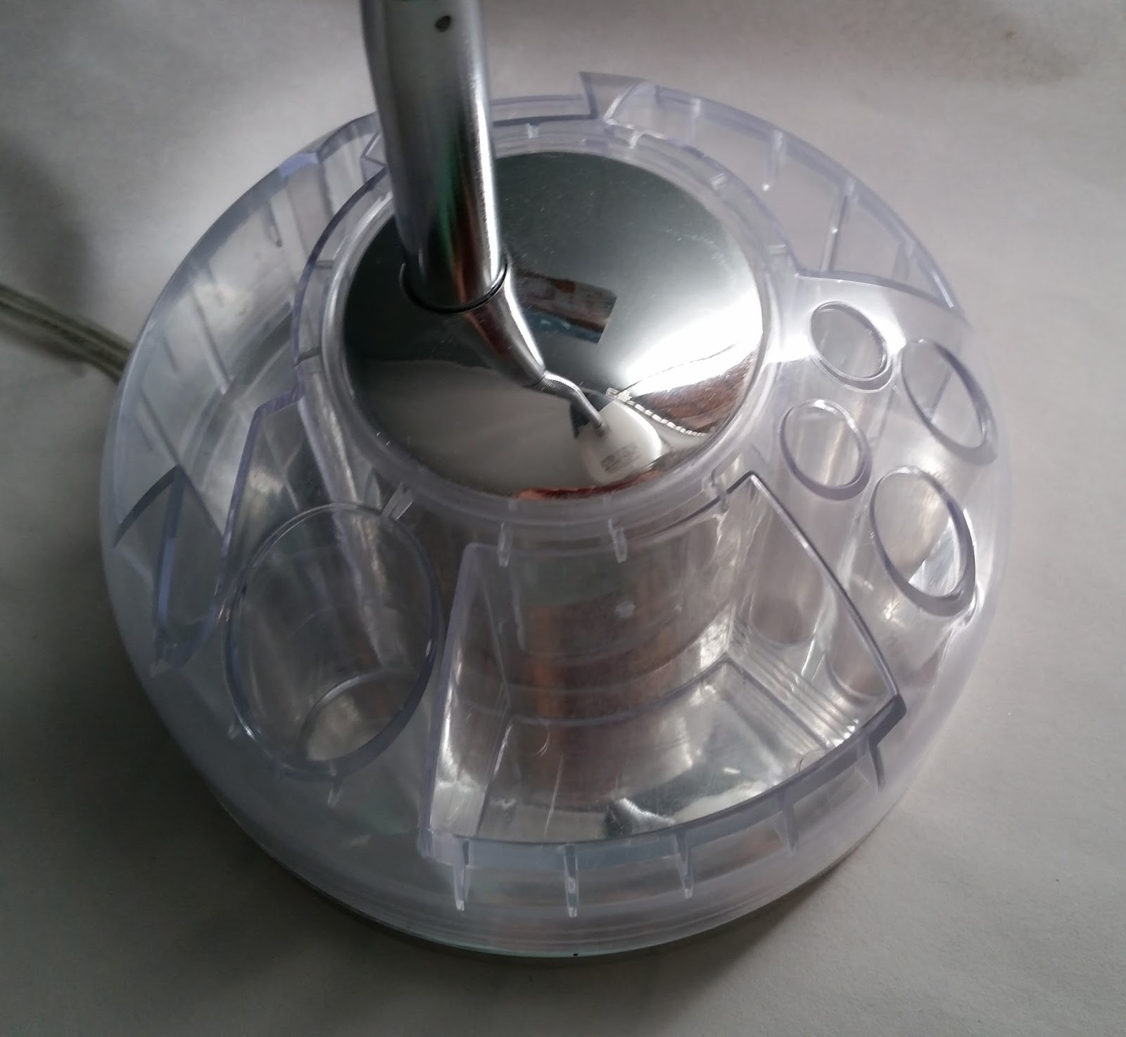
the suction tools allows it to intake large debris. The transparent dirt bowl is yet another great part of the design of this product. The transparent dirt bowl makes it easy to see the dirt inside and know when the bowl is full. The bowl is also removable (which makes it easy to empty the dirt), and it is also washable. The vacuum is made out of hard type of plastic, which is durable. Plastic material makes the vacuum to be light-weighted and easy to carry around. The colors chosen for this product—blue and white—are also very smart and good choice since the blue and white indicate cleanness and purity and this is what the product is intended to do, which is to clean and purify. All the features of this product are very effective and useful except for one thing. One improvement that would make this product even better would be to make the dirt bowl just a little bit more since the filter device is also located within the bowl and takes up some space of the bowl. So, it wouldn’t fill up soon, especially when there is a lot of dirt to be cleaned and the user wouldn’t have to worry about emptying the bowl so soon.


Royal 12-Sheet Cross-Cut Shredder

The product seen in the picture is a paper shredder which functions by electricity. The user has to plug the cable into electricity when they want to use it in order for the device to function. It has a thin area on the top part of the device, where the papers go through, and the user would have to press the on button next to the thin area to operate the device and then put the papers through it. Then, after the user is done, they would have to press the off button (there is only one button functioning as both the on and the off button). This device has a few good design features. This is a good device to be used at home for the household when they need to shred papers that contain personal or other valuable information. Moreover, this device is able to handle papers, credit cards, and staples. It is designed in a way so that it is able to shred up to 12 sheets of paper per each pass, which is a good feature since it can reduce the time of shredding, especially when there are more papers for the user to shred. Moreover, it automatically stops on paper jam which is another good part of the device. Additionally, the size of the device is a good size to be used at home by the household. Furthermore, the container in which the shredded paper is deposited has a handle which makes it easier to pull it out to check and see if it is full, or when it needs to be emptied. Also, this device has wheels underneath it which makes it super easy to move it on the ground without having to lift it. The material used for the shredder is a hard type of plastic which is durable and makes the device light-weighted. Overall, this device is a very useful device. There is one improvement which could be done to make it even better. It would be effective if the whole container in which the papers were deposited was a transparent type of plastic and the shredded papers were visible. This way, the user wouldn’t have to consistently check the amount of space available in the container by pulling it out of its place and then put it back to its place.


Sunday, November 22, 2015

Jergens Hand Cream

The product seen here is a hand cream, which is intended to soften and moisturize the skin. It is intended to be used by the general public. The cream tube has a great design. Soft and creamy colors (creamy green and pink) along with a soft type of plastic for the cream tube are chosen to indicate the softness of the product inside the cream tube. The curviness of the shape which has the soft pink color also indicates the purpose of the product inside, which is to soften and moisturize the skin. The fonts chosen for this are just the right fonts for this product to show the softness of the cream. All the words written except for the word Jergens have the same font which works very well for this product and the softness could also be felt in this font. The font of the word Jergens also fits very well even though it has serifs. If a close attention is paid to this typeface, one will notice the curviness and softness of the serifs and softness of the areas where different parts of each letter are linked together, which gives the soft feeling to people. The only slight improvement that could be made would be to lighten the colors used for the fonts to soften them to work well with the purpose of the cream.


Hanging Storage

What seen in this picture is a hanging storage. It could be either hung on the wall, the hanger in the closet, or the door hook hanger. There is a horizontal bar on the top part of the product which keeps the two top corners of the product straight without falling over. There is also the handle which is connected to the horizontal bar which is used to hang it to either a nail on the wall, or the hanger in the closet. The product is intended to be used by the public (all people) to put their items in it. It acts as additional storage where people could use at their home to put some stuff in it. It has 12 pockets overall, four in each row and three in each column. The material for this product is nylon, which makes the product light weighted. The nylon used in this product is durable in terms of keeping the weight of the objects put in it without being torn. The material used for the handle and the horizontal bar of the product is a tough and durable type of plastic, which is used in order to keep the shape of the product as it is seen since it is not a material which would be folded. Overall, this is a very useful product in terms of providing the user with additional storage space, but there is still improvements that could be done to make the product even more effective. All the 12 pockets of the hanging storage are the same size. If there were more variation in the sizes of the pockets (e.g., a few of the same size pockets seen in the current one and a few bigger ones along with a few smaller ones), it would be more effective since a little bit bigger or smaller sized objects could fit in the pockets easily.


Sunday, November 15, 2015

Cosco Ladder

The pictures seen bellow are showing a ladder, and it is a product of Cosco brand. This product was created so that people could use it to reach high places to grab something or to place something in its place (for example, to grab something from a higher level of a storage or placing something back in its place in the storage using the ladder, since the level of storage is so high that it cannot be reached from the ground). It is a great sized ladder to be used at home by the households since it has a pretty average size for the home use, or it also could be used in offices. However, it is not tall enough to be used in places where there are tall and large storages, such as stores like Costco and other places like this. The material used for this product is aluminum which makes the ladder very lightweight and easy to move around, but stable and safe at the same time since the aluminum has been compressed and gives the ladder a high strength. The good thing about the design of this ladder is that it is also folded so that it won’t take so much space when the user doesn’t need it and wants to put it aside. Another good part of the design is that there is enough space between the last step (the black one) until the very top part of the ladder so that while standing on that last step, the user could be more secure and protected, without the thought of falling over from either side of the ladder since there is something to hold on to while standing on that last step. However, there is still an improvement to make the ladder even better. The first two steps of the ladder could also be a little broader so that the users would feel more stable and secure while standing on either one of those steps and have more room to rest their feet on.


Target Logo

The logo seen in the first picture is for the Target stores, intended to be used by Target Companies/Stores to promote their business. It is created as a logo, to inform people about the business of the Target Stores. What seen is a simple design of a red bold bulls-eye with the word TARGET written in all caps, bold and in the same red color as the bulls-eye. The bulls-eye was chosen as a logo idea for Target Company since it fits with the name of the company, Target. As the bulls-eye represent the center of an aim in sports like shootings and archery, it also defines a similar meaning for the Target stores. It means that the Target stores are the center where everything could be found and aimed (all the supplies the customers need, from food to clothing, from electrical devices to school supplies, pharmacy needs and a lot of other things that one might need). The color chosen for the logo is red. Red is a warm color. The color red draws the attention of people to itself and make them take actions. It draws people in, makes them stop and pay attention. This is the reason that the red color works really well for Target’s logo. The letters chosen are sans serif and bold, written in red. In general, the boldness of the word TARGET and the bulls-eye along with the red color grab the attention of people.

The logo has been changed a few times, but the newer logo is more effective than its earlier versions. For example, in one of the earliest versions of the logo, instead of having only one red ring around the full red circle (the main target), there are two red rings around the full red circle in the middle with the word TARGET written on the rings in the center area in black. The word target in this earlier version is not a sans serif typeface since it has serifs. However, this logo is not so successful since it is a little busy having an extra ring and the word TARGET written on the rings. There are also some other former versions of the TARGET logo which obviously didn’t last and have been replaced until the newest logo came along. The current logo however, is the best of all its earlier versions and works better since it doesn’t have the complexity and busyness of the earlier versions. With all of its simplicity, the current logo is more interesting since it doesn’t have a script feel to it as it had with one early version of the logo (the script writing didn’t feed the purpose of the logo and Target Companies very well in general), or it doesn’t have the busyness of the one with two rings around the full red circle in the middle, or the one where the bulls-eye is hung from a lady’s ear as an earring and causes the logo to lose its functionality. Overall, the current logo works really well compared to the earlier versions. However, a little change/improvement could make it even look better. By changing the typeface to a serif font but not a very complex one (something similar to the font used in the version with the extra ring in it), but keeping the boldness of the font and the color red, to bring more flair to the logo.

Current Logo

Earlier version

Earlier version

Earlier version

Sunday, November 8, 2015

Desk Study Lamp

The object seen in the picture is a study lamp. It functions by electricity and by using the on/off switch knob on the top of the cover around the lamp. It is intended to be placed on a table, where the students want to do homework, study, or do projects, whether it’s at their home, an educational environment (schools), libraries, and other places like this. It was created in order to provide extra light (besides the light from the roof light) for students to take advantage of, while they are doing homework. Moreover, not all roof lamps are near the area where the student has his/her desk to do work on, so, this desk study lamp could be used to lighten the area where the student is working and providing him/her with more light rather than the light just from the roof lamps. The material used for the neck of the product, the piece that connects the top part—the cover around the lamp—and the bottom part, where the neck should rest is a metal piece since it is durable and able to hold the weight of the cover around the lamp on it. The metal neck is also flexible, which is a very creative designing idea for a study lamp since the students could bend the neck and as a result, to fix the direction of the lamp in the position they need (closer to them, or farther away which is based on their needs at the moment). The switch knob, by which the lamp is turned on and off, is also made by the same metal used for the neck. The material for the cover around the lamp is consisted of two layered hard durable plastics. The inner plastic is opaque and the second outer layer is a transparent type of plastic. As for the material for the bottom part of the desk study lamp, where there is a little storage, a hard, durable, and transparent type of plastic is used again.

The color choices are very effective and work very well. A transparent colorless plastic in some areas, along with the silver color for the metals and the opaque white for the other plastic for the cover of the lamp are chosen since the chosen colors and even the colorless transparent areas fit and go well with all other colors. So, this lamp could fit with every type of environment with different colors. This little storage in the bottom is one of the good parts of the design for this study lamp since it provides the users with extra space to place materials such as small notepads, flash drives, pens/pencils and other small material like the ones already mentioned. The good part about this storage is that it is designed in a way that it is not attached to its bottom area which makes it easy to rotate and the user would just have to rotate it to get to the needed area and pick the needed material. The shape of the cover around the lamp is very effective. It is similar to an oval like shape with the only difference that this could be a semi oval shape, and it is also only in 3D format. It is very effective since it has a fairly sized open area where it allows the light from the light bulb to spread and reach directly and effectively to the intended area, without having any barriers blocking the light from reaching to needed place. However, there is still one improvement that could be done to make this lamp even more effective. As mentioned earlier, this lamp is powered by electricity. However, if the designer of the lamp had designed it in a way that could be powered by using batteries (by designing a small battery area in the bottom of the storage zone), it would make the study lamp to be ported easily around and also use it in areas where there is no power outlet.


Juice Spoon

What seen in this picture is a spoon designed particularly for juices, intended to be used in glasses full of juices to mix the juice so that particles of the juice won’t aggregate at the bottom of the glass. This spoon has a very interesting design. The bowl of the spoon has a broad oval like shape (which is also big enough), and this makes it easier to mix the juice in just two or three quick rotating moves. If it was not a wide and big shape and was just a small shape, then it would take more than two or three quick rotating moves to mix it. Moreover, the handle of the spoon acts not only as a handle, but it also functions as a drinking straw, which makes the product act as a double purpose invention, and it makes an interesting and clever design.

The material chosen for this product is metal which makes it durable. The metal used for this spoon is a good type of metal so it won’t be rusted by washing it a few times. The good point about this product is the fact that it is washable and reusable, especially since it also acts as a straw and not only a spoon, so people won’t have to buy straws constantly for drinking their juice from glasses. The way to improve this product would be to bend the end part of the straw a little further to make it more convenient for the one drinking from the straw. Because the straw has very little bend in its end, it becomes the user’s job to bend his/her head forward to be able to drink more easily, and this could cause inconvenience for the users, especially those who have neck problems.